

Think of your store’s signage as its most reliable employee. It works around the clock, never calls in sick, and is constantly guiding customers, shouting out deals, and reinforcing what makes your brand special. It’s what turns four walls and a bunch of products into an actual shopping experience—one that has a real impact on what people buy.
This isn’t just about hanging a few signs. It's about giving your store a voice.
Your Store’s Unseen Salesperson
What if you had a salesperson who could perfectly pitch your brand to every single person who walked in, all without taking a single break? That’s exactly what great retail signage does. It’s far more than a tool for pointing to the exit or slapping a price on a shelf. It's a core part of your sales strategy, actively shaping a customer’s journey from the moment they arrive.
This "unseen salesperson" is the narrator of your store. It tells shoppers where to go, what's new and exciting, and why they should pick up a particular item. Without that guidance, customers are just wandering. They can easily miss key products or promotions, leading to frustration and, worse, lost sales. And that in-store experience is more important than ever—a study by the National Retail Federation found that 72% of consumers still count on physical stores as their main way to shop.
The Three Fundamental Roles of Retail Signage
To really get a grip on its power, you can break down signage into three core jobs. Each one plays a distinct part in making the customer’s visit better and nudging them toward the checkout.
Wayfinding Signage: This is the practical stuff. Think of these signs as your store's built-in GPS, pointing people to different departments, the registers, or the restrooms. Good wayfinding gets rid of confusion and makes shopping feel smooth and easy.
Informational Signage: These signs are all about education. They might break down product features, share your brand’s story, or offer up a sizing chart. By answering questions before a customer even has to ask, these signs build confidence and help them feel good about their purchase.
Promotional Signage: Here’s where you grab attention. From a massive banner screaming "50% Off" to a subtle, elegant display highlighting a new collection, promotional signs create excitement and a sense of urgency. They are your direct line to driving sales.
When you get these three types right, your store stops being a simple collection of products and becomes a curated journey. Your signage is no longer passive decoration—it’s an active player in the sales process, guiding, informing, and persuading every step of the way.
In the end, effective retail signage doesn't just decorate your store; it brings it to life. It’s the bridge connecting your products to your customers, telling a consistent story that builds your brand and fattens your wallet. As we dig into the different options out there—from old-school print to slick digital displays—just remember that every sign is a fresh chance to connect with a shopper and make a sale.
Mastering Traditional Retail Signage

Long before screens lit up our world, traditional signs were the silent workhorses of retail. And guess what? Their power hasn't faded one bit.
Think of traditional signage for retail as your store's physical handshake. It’s a tangible, reliable connection with customers that builds trust and literally guides them through your doors. These physical assets are still a cornerstone of effective marketing for one simple reason: they work.
From the humble sidewalk A-frame to sophisticated storefront lettering, these signs create a permanent brand presence that digital formats can’t always replicate. The market agrees. The global printed signage market was valued at over $40 billion in 2023, which tells you everything you need to know about its staying power. You can read more about the growth of the signage industry on uprinting.com.
Key Types of Traditional Signage
Navigating the world of physical signs is all about knowing which tool to use for which job. Every type has a unique strength, whether it's pulling in foot traffic or cementing your brand identity. Getting the mix right is absolutely crucial.
A-Frame Signs: These are your friendly sidewalk ambassadors. Placed just outside your entrance, they grab the attention of passersby with daily specials, a witty message, or a simple arrow pointing the way. They're cheap, portable, and amazing at turning street traffic into foot traffic.
Window Decals and Graphics: Your store's windows are a blank canvas just waiting to be used. High-quality vinyl decals can show off your logo, display store hours, or feature intricate designs that start telling your brand story before anyone even steps inside.
Banners: Got something big to announce? Banners are your best friend. Their large format is perfect for grand openings, seasonal sales, or special events. They’re cost-effective, versatile, and can be used inside or out to make a huge impact.
Dimensional Lettering: For a touch of class and permanence, nothing beats dimensional lettering. These 3D letters, often used for the main storefront sign, literally make your brand stand out. Made from materials like acrylic, metal, or wood, they signal quality and prestige.
Strategic Placement and Material Choices
A sign's effectiveness boils down to two things: where you put it and what it's made of. A brilliantly designed sign in the wrong spot is basically invisible, while a cheap material can seriously undermine a premium brand image.
For instance, an A-frame sign is useless if it’s blocking the sidewalk. It needs to be placed in the natural flow of pedestrian traffic to do its job. Likewise, indoor banners for a clearance sale should hang in high-visibility spots, like over the main aisle or near the back to draw shoppers deeper into the store.
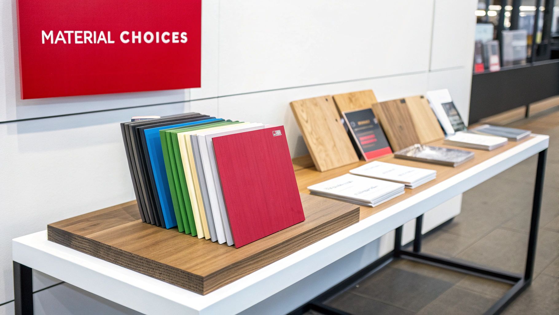
The right material not only ensures durability but also reinforces your brand's personality. A rustic wooden sign perfectly suits a boutique selling handcrafted goods, while sleek, brushed metal lettering would be more appropriate for a modern tech store.
Choosing the right materials is also a practical decision. You have to think about:
- Weather Resistance: For outdoor signs, you need materials like treated wood, aluminum, or weatherproof PVC that can handle sun, rain, and wind.
- Longevity: If it's a permanent sign, like your main storefront logo, it's smart to invest in durable materials like acrylic or metal. For short-term promos, affordable options like coroplast or vinyl will do just fine.
- Brand Alignment: The look and feel of the material has to match your brand's vibe.
By mastering these classic tools, you build a powerful foundation for your entire marketing strategy. Traditional signs are the reliable, ever-present voice that solidifies your brand in the physical world.
Understanding the Digital Signage Revolution

While traditional signs give your brand a steady, reliable voice, digital signage creates a dynamic conversation. Think of it as a living billboard inside your store—one that can change its message in the blink of an eye. This isn't just about swapping posters for screens; it’s a total shift in how retailers connect with shoppers right on the floor.
The idea is simple but incredibly powerful. A digital sign can showcase a breakfast special in the morning, pivot to a lunch deal at noon, and then push an evening promotion after 5 p.m., all from the same screen. That kind of flexibility turns a static fixture into a responsive, hard-working marketing tool.
This adaptability is fueling some serious growth. The global digital signage market was valued at around $28.83 billion in 2024 and is expected to climb to $45.94 billion by 2030. That’s a clear signal that retailers are going all-in on dynamic displays to elevate the in-store experience.
The Brains Behind the Screen: The CMS
So, how does a screen know what to show and when? That's where the Content Management System (CMS) comes in. The CMS is basically the mission control for your entire network of digital signs.
Instead of your team running around changing out posters, you can log into a central dashboard from any computer. From there, you can upload videos, schedule promotions, and tell specific screens what to play at specific times.
This centralized control is a massive advantage for retailers with more than one location. You can launch a nationwide sale announcement across every single store at the same time, keeping your branding tight and saving countless hours of labor.
To really see what's right for you, it helps to compare the two side-by-side.
Traditional vs Digital Signage: A Quick Comparison
Here’s a quick breakdown of how old-school signs stack up against modern digital displays.
| Feature | Traditional Signage | Digital Signage |
|---|---|---|
| Updates | Manual, slow, requires printing and shipping | Instant, remote, and centrally managed |
| Content | Static text and images | Dynamic video, animations, and interactive content |
| Cost | Low initial cost, high recurring costs (printing, labor) | Higher initial cost, lower long-term operating costs |
| Engagement | Passive, relies on static visual appeal | Active, captures attention with motion and relevance |
| Flexibility | Very low—what you print is what you get | Extremely high—change messages based on time, day, or sales |
| Consistency | Can vary from store to store | Easily standardized across all locations |
While traditional signs still have their place, digital screens offer a level of agility and engagement that paper just can't match.
Why Digital Signage Is a Retail Game Changer
Moving from printed signs to digital screens unlocks a whole new level of customer engagement and operational smarts. The benefits are practical, direct, and all about making the shopping environment better.
- Unmatched Flexibility: Instantly update promotions, fix pricing mistakes, or react to a competitor's sale without waiting for new signs to be printed.
- Dynamic Visual Appeal: Grab customer attention with motion, video, and vibrant animations—things static signs could only dream of.
- Targeted Messaging: Schedule content based on the time of day, foot traffic patterns, or even the weather outside to deliver seriously relevant messages.
- Reduced Long-Term Costs: Yes, the initial investment is higher, but you'll eliminate the recurring costs of printing, shipping, and installing paper signs for every single campaign.
Imagine this: A high-energy brand video greets customers on a large display near the entrance, while an interactive kiosk in the shoe department lets them browse styles that aren't even on the floor. This ability to tailor content to its context is what makes signage for retail such an intelligent tool today.
From Video Walls to Smart Shelves
The uses for digital signage are incredibly diverse, going way beyond simple promotional screens. Retailers are getting creative, using this tech to build immersive and helpful experiences that blend the digital and physical worlds. To get the full picture, it’s worth it to delve deeper into digital display solutions and see what's possible.
One of the most exciting developments is embedding digital displays right into the shelving. Electronic Shelf Labels (ESLs), for example, let you change prices on thousands of products instantly, ensuring accuracy and freeing up staff from a mind-numbingly tedious job. These smart tags can also show QR codes for more product info or even signal low stock levels to your team. To learn more about this specific tech, check out our complete guide to electronic shelf labelling.
Ultimately, digital signage transforms your store from a passive space into a responsive environment. It's a modern, engaging, and incredibly efficient way to talk to your customers, turning every screen into a chance to connect and convert.
How Signage Directly Impacts Your Bottom Line
While great design is important, effective signage for retail is ultimately about driving results. It's a strategic investment, not just a decorative expense. A well-executed signage plan translates directly into measurable business growth by influencing how customers behave, streamlining your operations, and ultimately, boosting sales figures.
Think of your signage as an active participant in every transaction. It's the silent force that can turn a casual browser into a committed buyer, make a frustrating wait feel shorter, or guide a shopper to an item they didn't even know they wanted. Each sign is an opportunity to improve the customer experience and, in turn, your financial performance.
Boosting Sales and Improving Customer Flow
Compelling signage is one of the most direct ways to increase sales. It’s pretty simple. A bold sign advertising a limited-time offer creates a sense of urgency, encouraging an immediate purchase. Similarly, clear wayfinding signs don't just reduce confusion; they guide customers through your entire store, increasing the likelihood they’ll discover more products and add them to their cart.
This enhanced flow has a direct impact on basket size. When customers can easily find what they need and are exposed to relevant promotions along the way, they naturally spend more.
Digital displays are particularly effective here. In fact, data shows that businesses that bring in digital signage see an average sales uplift of 31.8%. That makes it an incredibly powerful tool for revenue.
On top of that, these screens can make checkout lines feel shorter, reducing perceived wait times by up to 35% and preventing customers from abandoning their purchases out of frustration.
Calculating the Return on Your Investment
To truly appreciate its value, you need to connect your signage strategy to tangible outcomes. Calculating the return on investment (ROI) isn't as abstract as it sounds. It’s about linking specific signs to concrete metrics that show how they contribute to your bottom line.
The best way to measure the impact is by tracking key performance indicators (KPIs) before and after implementing or updating your signs.
- Increased Foot Traffic: Did that new A-frame sign or window display bring more people through the door? Track daily visitor counts to find out.
- Higher Average Transaction Value (ATV): Are customers spending more per visit since you added point-of-sale promotional signs?
- Sales Uplift on Specific Products: When you feature an item on a digital screen, do its sales numbers spike?
- Improved Brand Recall: Do customers remember your brand more easily after a visual refresh? You can measure this with simple surveys.
By tracking these metrics, you move beyond guesswork. You gain clear, data-backed evidence that justifies every dollar spent on your signage, proving it’s a vital engine for growth, not just another operational cost.
This data-driven approach allows you to refine your strategy continuously. If a particular sign isn't performing, you can adjust its design or location. One area where this is especially clear is with pricing.
For example, by exploring the benefits of electronic shelf labels in our detailed article, you'll see how dynamic pricing can directly influence purchasing behavior and optimize margins in real-time. This level of control turns your shelves into a responsive sales tool.
Essential Design Principles for Signs That Sell

Let’s be honest: a beautifully crafted sign that no one reads is just expensive wallpaper. In the blur of a busy retail floor, your signage gets about five seconds—tops—to grab a customer's attention, get a message across, and push them to act. If it can't pass that simple test, it's not doing its job.
This is about much more than just making things look pretty. It's strategic communication. Truly effective signage for retail is a deliberate mix of art and science, all designed to guide the eye and make even complex information feel simple. By mastering a few core principles, you can turn your signs from background noise into your most effective sales tools.
These fundamentals are what ensure your message gets seen, understood, and acted upon, turning casual browsers into committed buyers.
Create a Clear Visual Hierarchy
Visual hierarchy is all about telling a customer’s eyes where to look first, second, and third. Think of it as the visual equivalent of raising your voice to emphasize the most important part of a sentence. Without it, your sign is just a jumble of competing words and images, and the real message gets completely lost.
It’s just like a newspaper headline. The biggest, boldest text catches your eye first because it holds the most critical information. Then you move to the slightly smaller sub-headline, and finally to the body text.
You can build a strong hierarchy by focusing on a few key elements:
- Size and Scale: The most important part of your message (like "50% Off") should be the biggest thing on the sign. No question.
- Color and Contrast: A bright, high-contrast color will naturally pull the eye. Use it for your call to action or the main benefit.
- Placement: We’re trained to see things at the top or center of a design as more important. Use that to your advantage.
This kind of deliberate organization makes sure that even a quick glance delivers the most vital information, respecting your customer’s limited time and attention.
Master Typography and Readability
The font you choose does more than just spell out words; it sets a mood and, more importantly, determines if your message is even readable. A fancy, looping script might look elegant up close, but from ten feet away, it’s just an indecipherable squiggle. When it comes to retail, legibility always wins over intricate style.
When picking your fonts, keep it practical. Clean, simple sans-serif fonts like Helvetica or Arial are your best friends—they’re incredibly easy to read from a distance. You also need to guarantee high contrast between your text and the background. You can't go wrong with the classics: black on white or white on dark blue.
Finally, less is more. Stick to a maximum of two font families per sign. Any more than that, and you start veering into chaotic, unprofessional territory.
Harness the Power of Color and Space
Color is a potent psychological tool. It can stir emotions, direct attention, and reinforce your brand identity almost instantly. It’s one of the first things a customer’s brain processes, which makes it a critical part of any effective sign. Red, for instance, screams urgency and is perfect for clearance sales, while green can suggest health, nature, or eco-friendliness.
But it’s not just about the color you add. The empty area around your text and graphics—what designers call negative space—is just as important.
A common mistake is to cram every last inch of a sign with information. This just creates visual clutter that makes the entire message feel overwhelming. Giving your key elements room to breathe with plenty of negative space actually makes them stand out and feel more significant.
Using color and space properly doesn't just make your signs more attractive; it dramatically improves their clarity and impact. The right choices will integrate seamlessly with your store's entire layout. If you're looking for more ways to transform your store's appearance and boost engagement, you can find a ton of innovative retail display ideas to get you started. This visual strategy extends all the way down to the shelf, where technology can now give you real data on how customers interact with your displays. You can even learn how to monitor product placement with https://www.electronicshelftags.com/shelf-tracking-systems/.
Building Your Cohesive Retail Signage Strategy
A powerful retail signage system is never an accident. It’s the result of a deliberate, well-thought-out plan, not just a random collection of signs put up on a whim. Building a cohesive strategy ensures every single sign, from that giant banner in your window down to the smallest tag on a shelf, works in harmony to hit your business goals.
The whole process kicks off with one simple question: What do you actually want your signs to accomplish? Without a clear objective, you’re basically just decorating. Your goals are what will shape every decision you make, from the type of signage you choose to where you place it for the biggest impact.
Defining Your Core Objectives
Before you even start thinking about cool designs or fancy materials, you have to define your mission. Are you trying to drive a ton of traffic for a massive seasonal sale? Maybe your main goal is to improve the flow of your store to cut down on customer frustration. Or perhaps you need to educate shoppers about a new, kind of complex product line.
Whatever they are, your goals need to be specific and measurable. Here are a few common objectives that can guide your thinking:
- Increase Foot Traffic: Here, your focus will be entirely on exterior signage. Think A-frames on the sidewalk, compelling window graphics, and large, eye-catching banners designed to pull people in from the street.
- Boost Sales of a Specific Product: This calls for promotional signage placed right at the point of action—think end-cap displays, shelf talkers, and even dynamic digital screens showing the item being used.
- Improve In-Store Navigation: For this, your priority is crystal-clear and consistent wayfinding signage. This includes things like overhead directional signs, department markers, and aisle directories that make getting around effortless.
- Enhance Brand Identity: This goal is all about high-quality, permanent fixtures that tell your brand’s story. We're talking dimensional lettering on the wall, custom murals, and informational signs that build your brand's world.
Once you’ve nailed down your primary goal, it's time to analyze your physical space to find the best spots to communicate your message.
Conducting a Simple Store Audit
Alright, now it’s time to walk through your store with a customer’s eyes. A quick store audit helps you pinpoint the prime real estate for your signs—those key touchpoints where a customer’s attention is naturally going to land.
Start from the outside and work your way in. Pay close attention to natural sightlines and high-traffic zones. Ask yourself: Where do customers look the moment they enter? What path do they usually take? And where do they tend to pause or bottleneck, like at the checkout counter? These are your golden opportunities.
By identifying these hotspots, you can place your most important messages where they are guaranteed to be seen. This simple audit transforms your strategy from pure guesswork into a data-informed plan.
Creating a Signage Hierarchy
Let's be honest, not all messages carry the same weight. A sign shouting about a 70% off clearance event is way more critical than one pointing to the restrooms. A signage hierarchy organizes your messages by importance, ensuring your most vital information gets the most prominent placement and the best design treatment.
Think of it like a pyramid:
- Primary Signage (The Peak): These are your absolute showstoppers. This includes your main storefront sign and major promotional banners that scream your most important, time-sensitive offers. They should always be the largest and most visually dominant.
- Secondary Signage (The Middle): This layer covers your departmental signs and directional wayfinding. Their job is to guide customers through the store and help them locate broad product categories without any friction.
- Tertiary Signage (The Base): This is where your informational and point-of-purchase signage lives. It includes shelf labels, detailed product descriptions, and smaller signs that provide the details needed to drive that final purchase decision. For many retailers, exploring modern options like versatile E Ink signage can make this foundational layer far more dynamic and efficient.
Common Questions About Signage for Retail
Diving into the world of signage for retail always brings up a few practical questions. Getting the right answers is crucial for making smart investments and avoiding the usual pitfalls. Let's break down some of the most common questions we hear from retailers.
How Much Should I Budget for Signage?
This is the big one, but there’s no magic number. Costs can swing wildly depending on the size, materials, and tech you choose.
A good rule of thumb for an established business is to set aside 1-3% of your total marketing budget just for signage. If you're launching a brand-new store, you'll probably want to invest a bit more upfront to make that critical first impression.
To get the most bang for your buck, focus on the high-impact spots first:
- Your main storefront sign—this is what gets people in the door.
- Key promotional zones inside the store where you drive sales.
- Clear wayfinding signs to guide shoppers and prevent frustration.
What Is the Most Common Signage Mistake?
Hands down, the single biggest mistake is creating visual clutter. It’s tempting to think that more signs mean more communication, but it’s just not true.
When you have too many signs competing for attention, shoppers just tune it all out. Poor designs and a jumble of messages create noise, and your customers quickly learn to ignore it completely.
A winning strategy always follows a "less is more" approach. Every single sign needs a specific job. If it can’t get its message across in a few seconds, it’s not helping—it’s just adding to the noise.
How Often Should I Update My Signs?
The right answer depends entirely on what the sign is for. Your signage plan needs to be alive and breathing, with different pieces moving on different timelines.
Promotional and seasonal signs need frequent updates—think monthly or quarterly. This keeps your store feeling fresh and gives repeat visitors something new to see.
But for your foundational signage, like permanent wayfinding and your main brand messaging, you should leave it alone. Only change it during a major store redesign or brand refresh. This creates a stable, familiar environment while still letting you be dynamic with your marketing.


Leave a Reply
Your email is safe with us.